A4 media by altice usa
The Product
a4 media, owned by Altice USA, recently launched their Athena media campaign planning tool. Athena enables advertisers to reach more than 90 million U.S. households on television through cable networks, on-demand and addressable inventory across the U.S., and more than 45 million U.S. households through authenticated, privacy-compliant IP addressability supported by rich data sets and powerful analytics and attribution services in a simple, user-friendly way.
My Role
I was the only UX Designer at a4 Media. My role was to create a seamless Athena experience for Account Executives to create media plans. My role consisted of improving design on current UIs, designed new UI’s for new functionalities within the platform, conducted research such as user and usability testing sessions, and iterated on my designs based on user pain points.
General Validation for users
Problem
Athena lacked to provide validations to users, even for the simple things. The first thing I noticed is that the user did not receive any email or notification from Athena, letting them know that their Media Plan was submitted successfully. The user would just be left hanging in the dark. The next thing I found out is that users had a hard time knowing when is the right time to go to the next page, or even if they remember completed a specific section. Users did not want to spend the time to go back and forth all the time. This made their experience longer than it should be, leading to frustration and irritation.

Solution
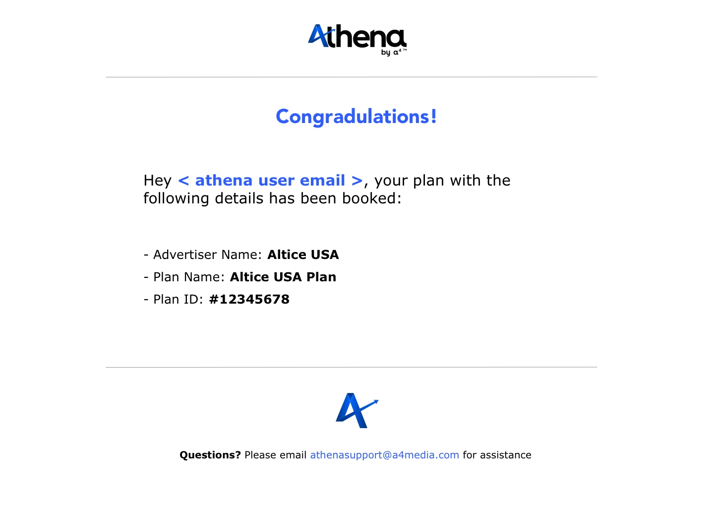
My solution was to first create an email that will be sent to the user as soon as their media plan is submitted. This will help the user know that their media plan was submitted successfully. Next, I added check marks on the top right corner of each step after it is completed, helping the user understand they do not have to go back to that specific step to see if it’s done or not.


results
Clients now are receiving emails confirming the submission of their media campaign. Because they do not have to keep going back to each individual section to see if each are finished anymore, they take less time completing the media plan. Using the time that they saved, they got to speak to more clients and to create more media plans, which equals more revenue for the company.

Information Architecture
problem
Stakeholders wanted to move away from an Excel like format to present information. Athena V1 was very text heavy. In particular, the Plan List screen. The list of media plans were presented in a spread sheet like format. Our users were having a hard time looking at so much information at once. Their confusion resulted in taking longer to find a specific campaign and would quickly get lost after a scroll of the mouse.

design thinking
When approaching this solution, I wanted to minimize the text on the UI and give more real-estate to the important actionable buttons. I want the user to be able to instantly see where their actionable button is located on the screen. The most important action is to create a new media plan. I made the first whole card a button in itself, giving more real estate of the screen to this button.


Solution
My solution was designing the media plan page using a card system instead of an excel spreadsheet format. This card system will only contain the most needed information, and will be a lot easier to read.

user testing
In order to find out what is the most important information our users really need to see on their plan list screen, I interviewed a handful of our local and national Account Executives. I interviewed half of them in person and half by the phone because we offices located across the country. Our AE’s can always click on the actual media plan to edit or view it, but we needed to figure out what was the information that must be present to minimize the amount of information on the screen. I asked them, out of all the information currently, what are the top 3 that you NEED. I found out that only 3 pieces of information on the media plan is needed to be presented on this screen are the plan name, the advertisers name and the date of the plan.

Results
Our AE’s instantly found it easier to look at their list of media plans. The updated card format is allowing the user to be more organized with their plans. This organization helps the user not to get lost when scrolling up and down, therefore keeping them calm and relaxed. Moving forward, we want to add a stronger search feature.

GEO Targeting
problem
Stakeholders wanted Athena to be able to target audiences specifically by location. A user should be able to search for a Zip Code, a DMA, or a State. In Athena V1, the user was only allowed to choose from a specific set of already provided locations. They were not in control of that part. We wanted the user to be in full control of selecting where they want to target. Being able to search and select a specific zip code or state in a search bar will be important.


solution
We wanted to create a user interface where they user can search or tap on a specific state, zip code, or DMA. After selection has been made, users will see all locations and can be deleted on the same screen if needed.
results
Last week Athena V2 officially launched and GEO targeting is now available for AE’s. Users can now target location using zip, DMA, and/or state. Our sales team are noticing an increase in client traffic after stating that Geo targeting is now available to their clients. Moving forward, zooming maps and interactive DMAs and zips are planned for future release.


