
Sponsor united:
Web App
Product:
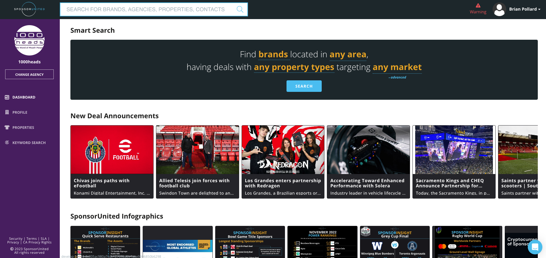
SponsorUnited is a Platform for data around sponsorships. Every professional sports team uses them.
A sports team will use this platform to look at specific data regarding sponsorships with any brand. You can search up a brand for Example like Pepsi, and then you can see all of the sports teams that Pepsi has sponsorships with.
Problems:
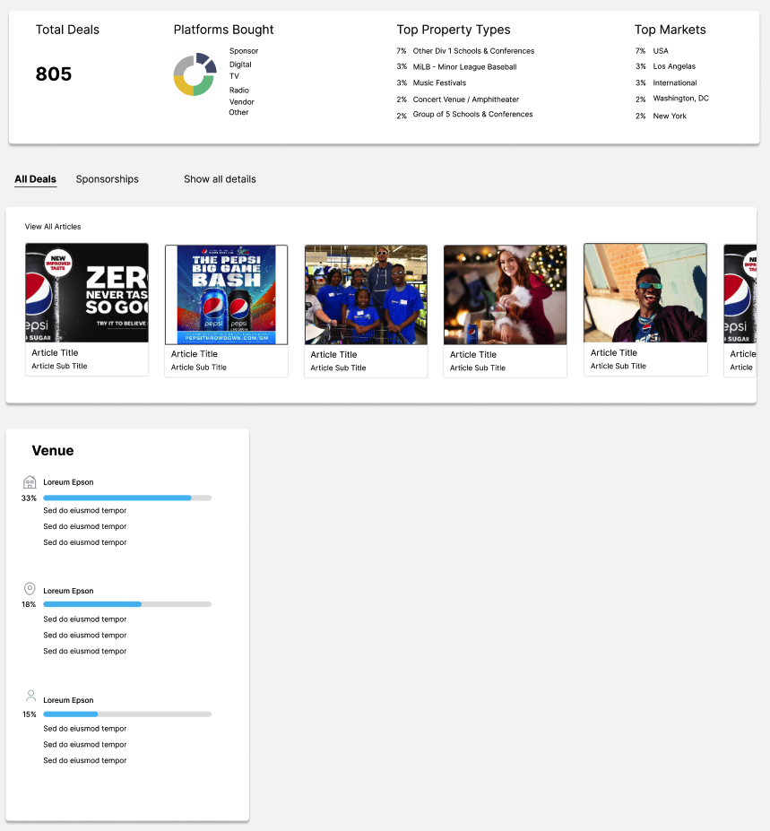
Problem #1: When the user filters by Property Type, all of the content updates. It is not clear to users that this happens.
Problem #2: When the user filters by Market, all of the content do not update. How can we fix that?
Problem #3: Create recommendations for general UX improvements of the product.
Understanding workflow and
component behavior:
This is where I screen shot each step in the filter user experience process.
I do this for 2 reasons
to familiarize myself with workflow and component behavior
in order to have access to the design itself so I can replicate it in my design solutions
Challenges:
1. Since I did not have the original design file with all of the elements to use, I had to design all of the elements myself. Once I created my elements, then I created my solution.
2. Another challenge was not being able to ask questions in real time.
I had to ask as many questions as I could before starting the project.
3. Lastly, assumptions were a challenge.
In order to design an information architecture, I need to know the elements level of importance and the level of user interaction with those elements.
Design Process:
I use a Lean UX method of design where we iterate our design based on learning from the user. We do this to minimize development time and to save money.
However, in this project I will use a waterfall method where I will be given a story and I will just hand off design. There will be no testing.
Research / Inspiration:
I first thought of what specific user experiences can I think about that can best relate to this specific problem.
(filtering, nav hierarchy, updating content on page, on a website)
Chase | Nike | Madwell | J Crew | A & F | Amazon | Apple Music
Now, I wanted to just brain storm leading companies because they spend a lot of money on learning and validation.
Apple | Paramount Plus | Netflix | Peacock | DisneyPlus
Pattern to Adopt #1)
Every element is its own element on top of the blank canvas.
Apple started this design.
Companies like LinkedIn are adopting this design pattern.
Pattern to Adopt #2)
Another leading pattern is Minimalism.
Apple again does a great job with this pattern.
Minimalism.
Less text | More icons | More imagery | Less colors | Only 1 or 2 CTA buttons

Pattern to Adopt #3)
Lastly, I was looking at leading websites and see how their filtering experience is.
I noticed a pattern of having a filtering system on the left hand side, and as the user picks a filter item, the content on the right hand side automatically updates.
Solutions:
Problem #1 - which is broke into
A. Possible Solution with the same Ecosystem Design
B. Possible Solution with a different Ecosystem Design
Problem #2 - is not in Figma because it is a basic code implementation. I would work with the developer to make sure that when the user presses on a market, that all of the data updates accordingly.
Problem #3 - General UX recommendation of the current product
Problem #1 -
A. Possible Solution with a Same Ecosystem Design
If I CANNOT move elements on the page in order to reach my goal.
If I can only add or delete elements / text.
My solution is moving over the “filtered by” text + making it bigger.
By moving the text, it will serve as a constant reminder for the user that the filter is currently being applied.

Problem #1 -
B. Possible Solution with a Different Ecosystem Design
If I CAN move elements on the page in order to reach my goal. I can add, delete, or move elements / text.
My solution is to create a new information architecture. The user will be able to filer on the left, and have content update accordingly.
Behavior: After a filter has been picked, the information on the right will automatically apply
User does not even have to scroll down in order to achieve their objective of filtering by Property Type
Behavior: As the user scrolls down, the Filter will be static and will allow the user to scroll the content up and down
The user can “Hide” the filters if they want to.
Problem #3 - General UX recommendation of the current product
Current Styling: Information is hard to understand at first glance with dark element backgrounds.
The dark color background of the element makes me feel distracted from the other elements. However, maybe that was done on purpose. Maybe the product wants the user to look there. However, if they want to do that, the product should designed in a different way.
Proposed Styling: Turn the dark background elements into white background elements.
This will allow the user to see the components and content inside the element faster.
Also, it will keep the styling consistent through out the page.

Results:
Current Landing Brand Profile page:
Has too many distractions.
Felt overwhelmed with the amount of colors and photos
Contains alot of text
Too many photos
Too many different colors
Too many CTA buttons
My Recommendation:
This goes back to the pattern of, information hierarchy is prioritized on what sections are giving the user the most value.
Since I do not have access to this data, this is an assumption.
Based on what I think brings the most value to the user, I will design the information hierarchy this way.
I am showing my recommendation side by side in order to show the difference between the 2 designs.
My design solution has:
- less colors,
- less CTA buttons
- overall less distractions.
- achieving a minimalistic design